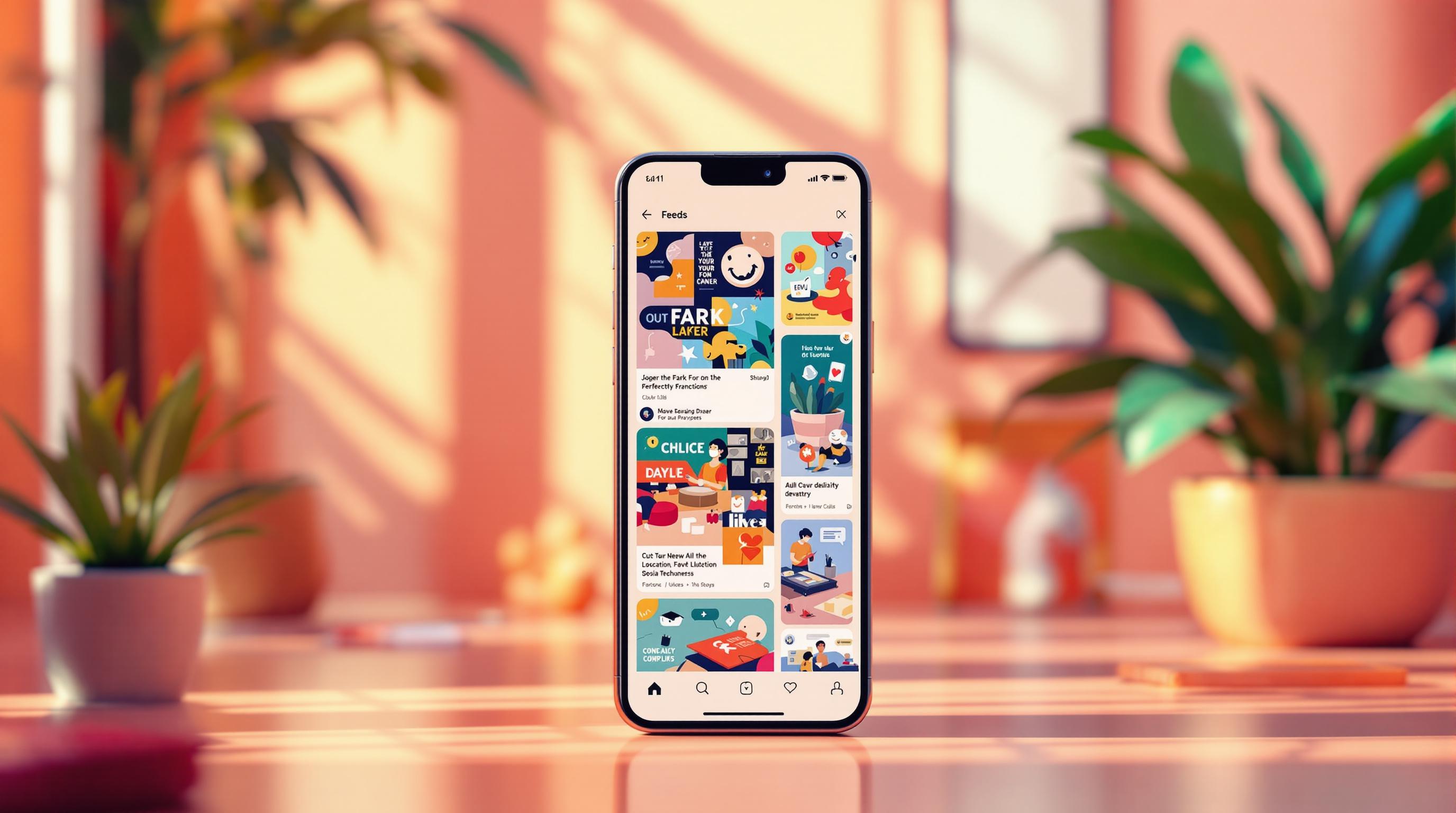
Want to boost your social media content? Start with these 7 design principles:
- Clean Layout & Space: Use white space, consistent padding, and clear divisions for better readability.
- Impactful Colors: Choose colors that evoke emotions, maintain brand consistency, and ensure accessibility.
- Readable Text: Use sans-serif fonts, high contrast, and platform-specific formatting for clarity.
- Content Placement: Prioritize key elements in your layout and adapt for platform-specific requirements.
- Brand Consistency: Stick to a unified color palette, typography, and logo placement across all platforms.
- Animation & Interaction: Add short animations or interactive elements like polls, AR filters, or sliders.
- Data Visualization: Simplify stats into charts or animations optimized for mobile viewing.
Why it matters? These principles help you stand out, connect with your audience, and drive engagement on platforms like Instagram and TikTok. Apply them to create visually appealing, mobile-friendly content that aligns with your brand.
Understanding the Principles of Design
1. Clean Layout and Space
A clean and spacious design is key to grabbing attention on fast-paced platforms like Instagram and TikTok. Overly cluttered designs are often ignored, while smart use of white space helps guide the viewer's focus.
Keep your design centered on the main content and use white space to support it. This approach creates a solid foundation for more advanced design techniques.
Here are a few ways to use spacing effectively:
- Edge Padding: Maintain consistent padding along the edges to avoid a cramped look.
- Text Spacing: Add enough line spacing to make text easier to read.
- Content Separation: Clearly divide different sections to make your layout more organized.
Even experts, like those at AdWeek, emphasize the role of clean layouts in boosting engagement on social media. A well-structured design invites users to interact, which is especially important on mobile devices.
White space isn't just empty - it helps viewers process information more easily. For layouts with lots of text, try using the Rule of Thirds to balance headlines, key points, and calls-to-action.
A clean design organizes content thoughtfully. Using grid systems and grouping related elements ensures your message stands out, even during rapid scrolling.
2. Using Colors for Impact
The colors you choose can significantly influence how your content is perceived. On platforms like Instagram and TikTok, smart color choices can boost engagement and help your brand stand out. A well-thought-out color strategy not only enhances your design but also reinforces your brand's identity.
Colors evoke emotions. For example:
- Blue conveys trust and reliability.
- Red grabs attention and signals energy.
- Yellow brings a sense of optimism, making it great for calls-to-action.
Key Color Tips for Social Media
- High Contrast: Use complementary colors to make text and visuals stand out.
- Brand Consistency: Stick to your brand colors to build recognition.
- Platform Adjustments: Tweak brightness and saturation to suit the specific platform.
Always test your colors on mobile screens and in different lighting to ensure they remain clear and readable. High contrast not only makes your content easier to read but also draws attention to the most important elements.
Accessibility Matters
To ensure your content is inclusive, keep these guidelines in mind:
- Avoid problematic combinations like red and green.
- Use tools to simulate how your designs look to colorblind users.
- Check that your color contrast meets accessibility standards.
3. Text Design and Easy Reading
Typography plays a key role in communication, complementing visual layout and color choices. Clear, well-designed text not only looks good but also makes your message easier to understand.
Font Selection Tips
Choose sans-serif fonts for a clean and modern look. Use bold styles for headlines to grab attention, while keeping body text simple for smooth reading.
Smart Text Formatting
Good formatting can make a big difference, especially on mobile. Use enough line spacing and break content into short, digestible blocks. Organized, concise sentences keep readers engaged.
Boosting Contrast and Accessibility
Make sure your text is easy to read by using high-contrast color combinations. Adding subtle background overlays can further improve readability across different devices and lighting conditions.
Tailoring Text for Platforms
Adjust your text style based on the platform. For example: keep Instagram captions short, use bold text for TikTok, and align text carefully for Stories to ensure clarity.
Experts, including those at AdWeek, emphasize that thoughtful typography strengthens brand identity and increases engagement.
sbb-itb-3858882
4. Content Layout Priority
When it comes to social media, how you arrange your content can make or break viewer engagement. Combining clean layouts with smart typography is just the beginning - prioritizing content placement ensures your message grabs attention and keeps viewers interested.
Visual Flow Optimization
Guide your audience’s eyes by placing key elements in the top third of the screen. Use size and placement to create a natural flow, with larger elements drawing immediate attention. Adjust these strategies to fit the layout constraints of each platform.
Platform-Specific Layouts
Each social media platform has its own quirks, so your content layout should adapt accordingly:
- Instagram Feed Posts: Focus on the center of the frame. Make sure your key visuals stand out within the initial 1:1 square crop.
- TikTok Videos: Keep important text in the middle third of the screen to avoid overlapping with on-screen interface elements like captions or buttons.
Testing and Analytics
Use built-in analytics tools to track how different layouts perform. Social media pros at AdWeek emphasize that regular A/B testing can uncover what resonates most with your audience. Use these insights to fine-tune your layout strategies.
Layout Elements Hierarchy
Prioritize your content elements so they work together seamlessly. Here’s a simple order to follow:
- Primary visual hook: A bold image or video that grabs attention.
- Main message or call-to-action: The key takeaway or action you want viewers to remember.
- Supporting visuals or text: Extra details that back up your main point.
- Brand elements: Logos, slogans, or other identifiers.
Mobile-First Design
Since most social media users are on mobile, design with smaller screens in mind. Keep text short and ensure visuals remain sharp and impactful, no matter the screen size.
Dynamic Content Zones
Set fixed zones for critical elements to maintain consistency across posts. For example, decide on standard placements for:
- Brand logos
- Call-to-action buttons
- Product details
- Engagement prompts
AI-Powered Layout Testing
Take advantage of AI tools to analyze past performance data. These tools can suggest the best placements for your content elements, helping you make data-driven decisions to improve engagement.
5. Brand Design Standards
Once you've optimized your content layout, it's time to focus on maintaining consistent design standards. A cohesive design strengthens brand recognition and builds trust with your audience. Consistent visuals also help keep engagement levels high.
Core Visual Elements
Here are the key components to focus on:
- Color Palette: Stick to a defined set of brand colors.
- Typography: Use the same typefaces for headlines and body text across all materials.
- Logo Placement: Ensure your logo appears in a uniform position.
- Visual Style: Apply consistent treatments to images and graphics.
Adjusting for Different Platforms
Your core design elements should remain consistent, but you'll need to adapt them to fit the requirements of different platforms. For instance, Instagram and TikTok may demand specific aspect ratios or text overlay styles. Customize your content for these formats while staying true to your brand's identity.
Creating a Style Guide
Document your branding rules in a comprehensive style guide. This should include:
- Specifications for brand assets
- Exact color codes
- Typography guidelines
- Approved template designs
Visual Consistency Checklist
Use this checklist to ensure your visuals align with your brand:
- Colors align with your brand palette.
- Typography matches your established style.
- All visual elements reflect your brand's overall aesthetic.
6. Animation and User Input
Adding animation and interactivity to your social media content can make it much more engaging. These features not only grab attention but also encourage users to interact with your posts, creating a more memorable experience.
Interactive Elements
Interactive tools make it easy for users to connect with your content. Here are a few popular options:
- Instagram Stories Stickers: Use polls, quizzes, and sliders to spark interaction and keep viewers engaged.
- AR Filters: Offer immersive, fun experiences that users can share with their followers.
Incorporating motion into these features can help direct attention and make the experience more engaging.
Animation Best Practices
When adding animations to your social media content, keep these tips in mind:
- Motion Timing: Stick to short animations (3–5 seconds) to hold attention without overwhelming viewers.
- Visual Hierarchy: Use motion to emphasize key elements, like a call-to-action or an important message.
- Platform-Specific Styles: Tailor animations to fit the vibe of each platform:
- TikTok: Quick, energetic transitions
- Instagram: Sleek, polished animations
- Stories: Snappy, eye-catching effects
Interactive Content Types
| Content Type | Purpose | Best Platform |
|---|---|---|
| Polls | Encourage quick responses | Instagram Stories |
| AR Filters | Promote user creativity | Instagram, TikTok |
| Quizzes | Share educational content | Instagram Stories |
| Sliders | Gather user feedback | Instagram Stories |
Performance Considerations
To ensure your animations and interactive elements perform well across all devices, focus on these key factors:
- Load Times: Make sure your content loads quickly and runs smoothly on various devices.
- Accessibility: Provide alternatives for users who may not be able to interact with certain features.
- Purpose-Driven Design: Each animation or interactive element should serve a clear goal, like driving clicks or boosting engagement.
7. Making Data Visual
Turning complex data into visuals can make your social media content far more engaging. On platforms like Instagram and TikTok, presenting numbers and stats visually can grab attention and improve performance.
Choosing the Right Format
The way you visualize data depends on the type of information you're sharing. Here's a quick guide to match your data with the ideal format:
| Data Type | Best Visual Format | Platform Focus |
|---|---|---|
| Percentage Changes | Animated Progress Bars | Instagram Stories, TikTok |
| Comparisons | Side-by-Side Charts | Instagram Feed Posts |
| Time Series | Line Graphs | Instagram Carousel Posts |
| Rankings | Vertical Bar Charts | TikTok, Instagram Reels |
Once you've chosen a format, make sure it's optimized for mobile screens.
Design for Mobile Viewing
Social media is a mobile-first world, so your visuals need to work well on smaller screens. Keep these tips in mind:
- Use large, bold numbers and text so everything is easy to read at a glance.
- Ensure strong color contrast between text and background for better visibility.
- Focus on simplifying your stats - highlight the most important numbers.
- Avoid clutter; prioritize clarity over complexity.
Animation Techniques
Adding animations can make your data pop. Use short, progressive reveals to show changes or comparisons dynamically. For example, a bar chart that grows in real time can be much more engaging than a static image.
Platform-Specific Tips
Different social platforms call for slightly different approaches. Here's how to adapt your visuals:
- Instagram Feed: Stick to clean, high-contrast designs that are easy to scan.
- TikTok: Use lively, fast-paced animations to match the platform's energy.
- Instagram Stories: Add interactive features like polls or sliders to keep viewers engaged.
Tools and Resources
You don’t need to start from scratch - there are plenty of tools that make creating data visuals easier:
- Canva Pro: Great for templates specifically designed for social media.
- Adobe After Effects: Perfect for adding animations to your visuals.
- Flourish: A handy tool for building interactive charts.
- Adobe Color: Helps you pick color combinations that are both striking and accessible.
Conclusion
Mastering social media design principles helps create content that connects with your audience and drives engagement. By focusing on the seven core principles, you can measure, test, and refine your strategy for long-term success.
Measuring Success
Keep an eye on key metrics to adjust and improve your designs effectively:
| Metric Type | What to Track | Why It Matters |
|---|---|---|
| Engagement | Likes, Comments, Shares | Reveals how well content resonates |
| Reach | Impressions, Profile Visits | Reflects content visibility |
| Conversion | Link Clicks, Website Traffic | Tracks business outcomes |
Testing and Optimization
Refining your approach requires a structured testing process. Focus on one design element at a time to see what works best.
Effective Testing Tips:
- Use A/B testing for at least two weeks.
- Analyze performance on each platform individually.
- Identify combinations that drive the most engagement.
- Pay attention to audience feedback for additional insights.
Staying Current
Social media trends change quickly. While the core principles remain the same, how you apply them should reflect the latest platform features and audience behavior. Watch for trends like:
- AI-driven personalization
- Augmented reality (AR) filters
- Targeting smaller, niche communities
Implementation Strategy
Put these steps into action to keep your design strategies sharp. Use analytics tools to monitor performance and refine your approach. Stay updated on platform changes and industry news through trusted sources like AdWeek. This ensures your designs stay effective while maintaining your brand's identity.








![Top 7 Best Instagram Growth Services in 2025 [RESULTS]](/cdn-cgi/image/fit=contain,format=auto,width=null/https://cdn.prod.website-files.com/67840d1d88a886f29a66a4c1/6795d12917ee4501b9eddf73_6795c731964f791db3b566c4-1737870861582.jpg)
![UpGrow Review – The Best Instagram Growth Service in 2025 [TESTED]](/cdn-cgi/image/fit=contain,format=auto,width=null/https://cdn.prod.website-files.com/67840d1d88a886f29a66a4c1/6795040db42e404207732526_6794fd9c964f791db3b48de9-1737818779111.jpg)


